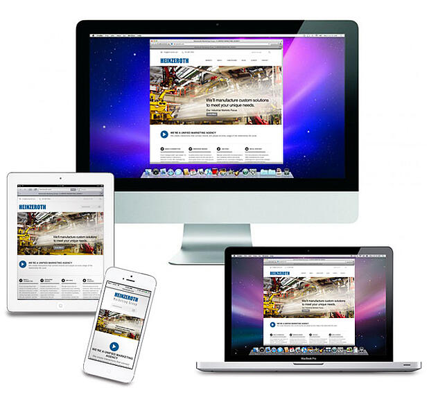
Responsive Web Design -vs- Adaptive Web Design
The accessibility of websites on various consumer devices is a fluid issue, creating both opportunities and challenges for creative web developers. From traditional computer screens to smart phones, tablets, gaming consoles and even refrigerators and home security systems, the technology for web-enabled gadgets is continuously evolving.
As a product manufacturer, whose ultimate goal is to sell more products at a profit, how does your brand develop a website that enables cohesive messaging across multiple platforms, when the game is always changing? Two web design approaches have been developed to address this challenge and provide web users with an optimal viewing experience; Responsive Web Design (RWD) and Adaptive Web Design (AWD).
While both approaches are successful at providing an enhanced user experience for different mobile devices, the delivery is distinctly different.
Responsive Web Design enables the users viewing experience to fluidly change and fit any screen or device size.
Elements:
Focuses on the browser
Programs elements, such as CSS3 modules, fluid grids and flexible images into the design to create a "flexible" foundation
Enables navigation with a minimum of resizing, panning and scrolling
Pros:
Content Accessibility
Website Maintenance
Easier For Search Engines To Find
Cons:
Load Times Due To Complex Code
Delivery Of Mobile Specific Content
Adaptive Web Design enables the users viewing experience to adapt to a predetermined screen or device size.
Elements:
Focuses on the user
Uses predefined layout sizes, CSS and Java to detect the device that is being used and then adapts the view to fit the screen or device
Pros:
The development of separate website/HTML, allows site optimization (specific files and templates for each device)
Pages load fast
Cons:
Requires the development and maintenance of separate websites, either by URL or HTML/CSS code
When deciding between RWD and AWD, companies should consider their customers and the web-enabled devices they may be using. For more detailed information about responsiveness and adaptive web design and which approach is optimal for your business setting, check out these source URL's:
http://www.bluetrainmobile.com/blog/responsive-web-design-a-marketers-friend-or-foe/#.UuKQOOLnaUk
http://www.webmonkey.com/2013/05/the-two-flavors-of-a-one-web-approach-responsive-vs-adaptive/
http://www.bluetrainmobile.com/blog/responsive-web-design-a-marketers-friend-or-foe/#.UuKQOOLnaUk

